Friday, April 30, 2010

Kyle 4/30/10


This one really took me a while...I'm just not used to markers...not used to how they move, how to blend them, how they work in my hand...its getting better though. I really need to get the skin tone set and a cool gray set if I want to keep using them.

I like the fact that I can layer them like water color to deepen tone, but I don't like that I can't mix my own colors into one marker like I would load a brush with a color I mixed...I have to layer colors which is something I'm not used to yet. The coats in this sketch, for instance, took me forever to get close to right (they're a little too dark, but its just a suggestion!). There are seriously, like, 5 colors of marker on there.

I'm not all that happy with the streaky look of the trousers, but that's just me...I'm not used to the way markers look when I use them. I can look at other designer's marker renderings and say, "those look wonderful!" and I'm just kinda "blah" about mine...they aren't bad, I'm just not used to them.

Using markers is wonderful though. There isn't that pesky drying time you have to contend with when using paint, and the color is even - you reach for a marker and you know exactly what color is gonna come out. I really want to keep working with them...maybe try to get myself loosened up. I think that this summer (not that I'll have much free time) I'll take some of the Merry Wives and Into the Woods sketches with me and color them...and then post them. And you all can tell me what I'm doing wrong (hopefully I'll do some things right).

Eric 4/30/10

One full week!  One full week!  Gooooooo me!

I'm really happy with this blog, and let me tell you why.  Getting into the habit of thinking about doing one sketch per day has enabled me to pace myself in prepping for a show deadline.  In this case, I may have put off coloring all of my Wonka sketches until tonight, which would have created an unpleasant and sloppy coloring marathon this weekend.  Instead, I've pushed myself to get one done a day, to take my time, and now I only have two sketches left to color this weekend.  Awesome.

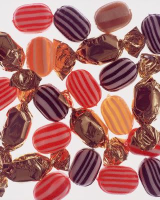
These are the lovely Grandparents, whom I pulled very strongly into the world of candy and chocolate.  They may be poor, but I want them to look warm and friendly.  To me, they're like the bowl of hard candy your great-grandmother always had sitting out on the coffee table.  Here is my color inspiration:

Every time I think I'm getting good with markers, I either screw up something really badly (which I did in the case of Grandma Georgina, but fixed) or figure out a new technique that I needed three sketches ago.  I figure though, that this is a lifelong process and I'll look back at these sketches a year from now and laugh at how much I didn't know.

Thursday, April 29, 2010

The Return....OF KYLE!!!!! AGGG!!!

Hey friends! Sorry I've been away for so long...its been way busy at work and with gearing up for the Summer...

Anyway, speaking of Summer, that's the subject of my post today. I'm going back to Great River Shakespeare Festival (www.grsf.org if you're interested) where I'll be assistant designing the costumes for Othello, designed by Devon Painter, and the "Design Coordinator" for a musical called The Daly News. Its basically a re-mount of a production done a few years ago, but we are re-imagining a few things. Its a really lovely show with three actors that play lots of characters. Things move really fast so the characters need to be easily identifiable and quick to get on and off. It lots and lots of hats and coats. I'm only rendering things that are different from the original production.

Martin is the patriarch of the Daly family (he's played by the playwright, Jon Daly, who also happens to be his Grandson) whose children have all shipped out to fight in World War II. Every week he compiles all the letters that he gets from them and adds news from the home front into a news letter called "The Daly News" and sends it out to his kids to keep the family in touch.

The base costume for all the actors is a shirt and pants. In the past production he wore a cardigan and spectacles, which he's wearing here, but I'm getting new ones rather than renting them. There were issues with the fit of the cardigan in the past production, so I'm buying two sizes and seeing which fits Jon the best.

Shatzie is Martin's wife. An apron has always been used for this character, but was far too full and frilly in the past production. I found a really lovely apron in my research online and planned on building it. AND THEN I found the pattern in stock at work...I was so happy. We'll have to scale the pattern up to actually fit a man, but its a start!

I have a few more sketches to do...I'll post more as I get them done. I'm using markers for the first time in years so I'm doing lots of playing...its hard to get may hand used to the markers after being so used to a paint brush, but the markers go so much faster and considering that I leave for Winona in exactly one week, I need all the speed I can get!!

Eric 4/29/10

So, I think I redeemed my time a bit today, since this one did not take me six hours.  I attribute that largely to the fact that they're all wearing pants, and those are pretty simple to color.  Plus, these are all clothes that I pulled from the Old Navy website, so there was little to figure out.

Something interesting that has come up, and I'm hesitant to talk about it so it's not taken out of context, is the issue of race.  Yesterday, I was asked why all of the bad kids and parents where white; and not just white, but the exact same hue of Caucasian.  In real life, some are pale, some are tan and some are in between.  Well that is because I learned ONE way to color white skin, and I used it over and over as a time save more than anything.  That, and costume sketches are illustrations, not photo-realism.

But it got me thinking: why do I default to drawing a white person with Brick Beige skin and a perfect body?  Well, I don't think there's an easy answer.  In truth, I tend to like to draw men over women as well.  I'll default to drawing a white male than anything else.  Mostly, I think I do it because I just don't think: I draw.  Today I thought about it, so I tried to represent some diversity.

I'm going to keep this more in mind from now on.  I admitted earlier in the blog that I wanted to explore more diversity in my drawing, since I've always just defaulted to what I see in the mirror.

Wednesday, April 28, 2010

Eric 4/28/10

This sketch took foreeeeeeeeeeeeeeever to color!  But, it was eight figures in all, so I'm pretty sure I'm allowed for it to take some time.  Either way, I'm really pleased with it.

One of things I like best about the sketch is Violet's Girl Scout Uniform.  I referenced an actual uniform for the color and it took five markers to get it with all of its highlights and shadows.

The director asked me specifically not to "color block" the families, so that they can be more individual.  Although I did connect them through hair color and style, I allowed them to find their own color identity.  Their palate is to be more demure, so that the chocolate factory can be more contextually vibrant.

Just a few more to go!

Tuesday, April 27, 2010

Eric 4/27/10

And from work, no less!  This sketch is the immediate Bucket family, Charlie (for most of the play and his transformation at the end), Mother and Father.  I took a picture with my camera, so the contrast is a little bit off.

I was really uninspired on what to do for Mother.  So being at work, I just went down to stock to see what we have and what I could re-purpose.  And voila!  I found all of those pieces in stock, which would give me a general path to follow for the mother.  Charlie and Dad will have their sweaters done custom.  I have intentionally drawn Dad's sweater to be a little bit too big and yet too small.  It's a well-made sweater that he's needed to keep in use for a long time.

The other great thing is that Charlie's apron for the end is the actual fabric that LAYNE found during a trip to Hancock's.  Yes, it is a white cotton with a border print of those amazing dots.  For the hat, we are going to cut smaller dots from the larger ones to create the border on his little Candyman hat.

I'm glad I'm able to slowly get these colored instead of a mad dash to the end.  I'm enjoying taking my time with the marker, doing lots of tests and trying to get as much detail in as I would do with something like acrylic or colored pencil.  It took me a little bit to remember Bill Black's method for coloring faded jeans.  I still don't think I have the finesse with it he does.  I know he uses Periwinkle in there somewhere, but for the life of me I couldn't make THAT work.

Monday, April 26, 2010

Eric 4/26/10

My focus this week will be on coloring my Wonka sketches, since they're due Sunday.  So I'm sorry to say that I won't be posting new drawings until next week.

Coloring is one of those things that I stress about until I start.  Then, I LOVE it!  I think it hearkens back to my love of coloring books when I *was* a kid.

For this show I'm using marker, for several reasons.  One, I think maker provides a fun, intense color with little to no fuss.  Two, it's quick to get to the color I see in my head.  Three, there is no dry time, which always gets me into trouble with watercolor.  I've used markers enough that I'm pretty familiar with color quality and hue, but it's still a game of experimentation.

In my grad program, I had two colleagues that were amazing with marker: my professor, Bill Black and my classmate Emily Strickland.  Those two can make marker look gorgeous and effortless.  I used to always beg Bill to teach me marker, however, he always said he couldn't.  Bill just picked up markers one day and started playing, and he encouraged me to do the same.

So, I still consider myself "playing" with marker.  With every sketch, I invent new tricks and techniques and keep finding new ways to articulate the figure.  And my cats LOVE it when I spread around 300 markers on the floor.  It's like kitty porn.

Thursday, April 22, 2010

Eric 4/22/10


Since I'm kind of caught up on my current shows, tonight I drew something more random. I looked up some of John Galliano's couture and decided to draw from that.

The fashion figure is so unlike the figure I know, I think I instinctively added curve and form to the woman, rather than accurately capture the image in front of me. The angle of the model made drawing the boots... interesting. I mean, there was no heel for a grounding, so it ended up looking like these weirdo bound stumps. But I tried!

It was sort of freeing to just draw something random. Also, I'm sketching FAST! It's like getting down to about 15 to 20 minutes to get these done. I suppose I could go slower, but I'm not stressing out about drawing anymore. I seriously used to STRESS OUT about drawing, and now I don't think anything of it. If I'm comfortable at this speed, then I should continue to roll with it.

So, does anyone read this blog, still? I mean, I started this as a motivational tool to keep me drawing, and I think it's been 85% effective for that. Then it turned into a great feedback tool. Now it seems... solitary? Are you out there, readers?

Wednesday, April 21, 2010

Rachel 4/21/10


I'm trying to be circumspect about the learning curve in terms of sketching using a tablet computer, and not be too hard on myself. This is my third sketch ever on one; still, it's hard not to page back to my pencil sketches and look at this with the hypercritical eye of "Man, these blow."

That said, i'm happiest with this one so far, in that i tried doing a sketch in which i attempted to use the limitations of the tablet as strengths--avoiding any attempts at fine detail drawing, and employing monochromatic layering of different color-application tools to indicate stylized depth. And, looking at some images of period fashion designs helped too, with their thick border lines around figures.

I need to figure out a method to create facial features in this medium so that all my folks don't just look like the same mannequin. Right now, i feel like this character resembles Miss Alma too closely, because i can't get in there to really draw detailed features.

So, this is Rosa Gonzales, Miss Alma's rival for Dr Buchanan's affections. Her dad owns the casino in town where Dr Buchanan spends all his evenings (and money) gambling and boozing the night away. She's a peacock, sexy, adventurous, disreputable, so she's wearing an arm-baring evening gown even though in this scene she's strolling in the park.

I dunno, i may abandon the wacom as a tool, but i feel like i should give it a good old college try, and will hang in for at least a dozen sketches. If i do a dozen renderings on it and still feel frustrated by the product, i'll return to pencil. What i'm hoping is that after a dozen, i'll at least be heartened about its potential. I do appreciate this pulling me out of my comfort zone, in terms of style and how i think about building a sketch. And I'm looking forward to trying out working with it in a program other than Paint though; that may change my mind for the better. I'm determined for now to keep on pushing these pixels!

Eric 4/19-4/21


I've been battling a cold for a couple of days, which knocked me out of the sketching mood. However, today I did three for Monday through today.

These roughs are for my next next show, River Rat and Cat. It's small, and will tour throughout the schools in Kentucky and the region this fall. Here is a brief synopsis of the show, pulled from the publisher's website:

No one has ever understood the mysterious friendship of River Rat and Cat. From the day fastidious River Rat hauled a drowning sodden Cat from a sinking basket (thinking Cat was some unique collectible), all of the river creatures have been dismayed by the camaraderie of this unlikely duo. Cat proved to be imaginative, grand, fussy and thoroughly needy, while Rat is material, practical and thoroughly self-reliant. Lately, Rat has become frazzled by Cat's demands and has undertaken a program to make Cat more self-sufficient. However, Cat is determined to remain a pampered feline. Unbeknownst to River Rat and Cat, their downstream neighbor, Dale Beaver, has cast an eye on the one remaining tree, a tree currently owned by River Rat and inhabited by Cat. Beaver needs this tree if the Dale Beaver Dam is to remain the tallest on the river. Beaver must break up this friendship so that Rat will evict Cat.

There you are!

I'm keying in on Beaver's highly militaristic style. He never comes onto stage without a march and cadence. His costume is inspired by WWII British uniforms, with many natural touches added, like the bottle cap medals and the ivy citation cord.

I think of River Rat as a hoarder. He lives for his possessions, and will do anything for them. He's that hobo who lives by the river and has his shopping cart full of wares. His pockets are stuffed full of his worthless treasures, and his clothes reflect his focus: his possessions are what matters, not his appearance.

Finally, there's Cat, who's a bit of a runaway. Cat's a house cat who is living the wild life outdoors. He's pampered, spoiled and out of place, but he loves it. He reminds me of the those young boys from highly proper backgrounds who want nothing more but to play in the mud.

I liked getting back to my usual sketching style, although I think they all have big heads. I also am very deliberately choosing not to go "all out" on the animal qualities. This attempt is just adding tails to character-inspired costume.

So, we'll see how it all goes in my design meeting tomorrow!

Monday, April 19, 2010

Rachel 4/19/10


So, i took a bit of a hiatus from sketching due to USITT and a couple of guest lectures i had to take care of first, but tonight i had the chance to get back into it and decided to give the Wacom sketching another try, this time without trying to incorporate color.

This is Alma Winemiller when she runs next door at 2am in her nightgown and robe, under the pretext of needing some "nerve pills" but really so she can fling herself at Dr John in her nightwear...except he's in his office drinking with his floozy girlfriend Rosa, and Alma is humiliated.

Here i've kept in the theme of asymmetrical elements for her, with her crossover imbalanced overrobe and its two weird skirt tucks on the side--lots of strange blousy horizontal arbitrary pleats and tucks in this period showing up in skirts and long peplums, and i found the hem ruffle robe in a Sears catalogue. Its fussiness made me laugh; only Alma would try to seduce someone, however ineptly, in a nightgown trimmed like a renegade lampshade from a child's bedroom. Also, clearly she's someone who is both trying for a period coiffure but having issues with Southern humidity and flyaway hair-frizz here.

I'm happier with how the Wacom drawing experimentation has turned out this time, and i'm looking forward to having the time to really jump into it, and get a more thorough feel for it as a sketching tool. I can tell that there's a lot that can be done, but i'm still learning to drive with the training wheels on as yet.

Friday, April 16, 2010

Eric 4/16/10


Here's a colored sketch for the "Chorus of Chefs" for Augustus Gloop's solo number. Since he is inescapably German, I decided to play with the scale of a standard chef hat, and combine it with a traditional Olive Garden waiter, and integrate the colors of the Bundesflagge.

So, there you go.

I'm starting to color the rest of the sketches this weekend... nothing like being two weeks ahead of the deadline!

Again, these sketches are bigger than my scanner, so I promise they have feet.

Wednesday, April 14, 2010

Eric 4/14/10


I'm not happy with the Oompa Loompas, and it finally occurred to me as to why: in the quest for individuality, I think I've lost their "spark". In every aspect of the design, we've sought out a strong sense of individuality, which I love. However, the Oompas function and exist ENTIRELY as a group.

What I am inspired by is the idea that they are, in fact, factory workers. They can still have personality, but they gain a much higher level of functionality.

In this design, they would be in black coveralls. Their names, back patches, trim, pockets, appliques and socks would be in the bright colors. They all don't even have to be polka dots, as I can source soccer socks in MANY varieties of patterns and colors.

What this also does is allow for a stronger context for all of the OTHER individuals to stand out more clearly. The kids, bad kids, Buckets: they now have a more solid group to play against, rather than an overwhelming amount of individuals competing for visual attention.

So, I've really not drawn someone from the back in a long time. I just decided that it could be a different person, since I was having a horrible time trying to find the same figure in reverse. If this idea flies, I'll just sketch the other five Oompas around these two.

Tuesday, April 13, 2010

Eric 4/13/10


I actually have a Tuesday sketch! Today I spent a lot of time AT work doing Wonka sketches. This is a plate for the "kids" in the show. Essentially, they are chorus in the opening, and crowds around the chocolate factory.

Since GLEE is on, I'm keeping this short and sweet. Two points:

1. I feel like this looks like a Gap ad.*

2. I modeled one guy's hair after Justin Bieber.

Later!

*since I looked at Gap ads, I think this appropriate

Monday, April 12, 2010

Eric 4/12/10


Tonight's sketch is my revision for the Oompa Loompas. On Friday, I talked about how the directors wanted to shape the Oompas into clear individuals. So, this is my first pass at that. There are six Oompas (with possibility of one to two more).

From left to right is Oompa Loompa Doompa (the slow one), Oompa Loompa Zoompa (the fast one), Oompa Loompa Joompa (the one who likes to jump), Oompa Loompa Scoompa (the digger), Oompa Loompa Boompa (the clumsy one) and my personal favorite, Oompa Loompa Bruce (the gay one).

To be honest, I don't have tons more to say about these guys. So we'll just see what the directors say!

Friday, April 9, 2010

Eric 4/9/10


I'm not gonna lie, I did not draw this sketch today. I know, SCANDAL! But I did draw it this week. I wanted to make it a week, so sue me.

I consider this a "character" sketch, not a costume rendering. Although Wonka is where I am want him to be in the process, the Oompa Loompas are "under construction." Here are some factors were are considering for the Loompas (some of these tenets came out of the directors' responses to the sketch):

1. Each Oompa needs to have a specific and unique identity. We're even going to name them to the tune of "Oompa Loompa Zooma" and "Oompa Loompa Bloompa." My suggestion of creating a homosexual Oompa called "Oompa Loompa Bruce" didn't make it.
2. They will have a strong sense of make-up.
3. We will be seeking many different heights of Oompas, not going to cast for a universal little person.
4. Their colors will match the intensity of the chocolate factory.
5. They each need a stronger sense of fit, to allow for more complicated movement.

So, tomorrow (probably Sunday) I'll be redoing this one, and we'll see what happens then!

Thursday, April 8, 2010

Kyle 4/8/10

Back to the blog-stone, as it were. I haven't really gotten as into this project as my earlier ones, oddly enough. I can't really say why. I really love the play and can see in my head what everything looks like, but its a realistic play set in 1934...so I'm basically picking clothes out of catalogues (though, I know, as Bill Black says, "Designing is choosing."). And I've been a bit preoccupied...but enough excuses!

Karen Wright is the other co-founder of the girls school in The Childern's Hour. She is much more romantic and less confrontational than Martha (though the students still respect her authority). She has been engaged to Joe (who we've yet to meet) for several years.

I'm not exceptionally pleased with this sketch. Its passable, I suppose. I didn't try too hard with the pose (I tried to not look at a reference for it - though I did reference the face) and its a little off...it lacks movement, I guess. Very static. I'm OK with the face - it got a little long and is a bit too big for the figure. I like the dress, but the sleeves are a bit too full and the pattern is all wrong. I pretty much pulled it from the Spring 1934 Sears Catalogue, cut and print...the cut is right, but the print just doesn't work. Oh well, you win some, you kinda win some.

I'm going to be spending a lot of time at work over the next few weeks while also getting ready for the Summer. I'm gonna push to get this project done before May though...We'll see how it goes!

Eric 4/8/10


**note: Even though I just bought a large-format scanner, I decided to draw Wonka stuff on HUGE paper, so they can't be completely scanned. Please use your imagination to fill in the stuff the scanner cut off.

This plate shows the Candyman, Phineas Trout (a reporter) and Wonka. One of the main ideas the directors and I want to convey is the Wonka exerts incredible influence behind the scenes. In other words, we choose to believe that it was no accident that these five children were the ones who found the Golden Tickets.

That being said, we want the audience to feel like Wonka has "agents" all over the world, namely the Candyman and Trout. I'm trying to echo Wonka's patterns (and ultimately his colors) in their costumes. Additionally, they both have a Wonka logo on their clothes: one on the Candyman's apron, the other on Trout's lapel.

I used to be so horrified at the idea of drawing multiple figures on one plate, but I'm really starting to get into it. I helps me control proportion, and it forces me to get more done. After all, in three sittings this week, I knocked out sixteen costumes rather than just doing three singular sketches. When I was less confident in my figures, I used to STRESS OUT about making them all "match".

Although I'm teeeeeechnically behind, I'm going to get Wonka knocked out really soon! I promise!

Wednesday, April 7, 2010

Eric 4/7/10


Tonight I redrew the bad Wonka kids, this time with their parents, and more in the figure style I'm going to use for this show. I kept thinking that the sketch was taking me FOREVER, but then I remembered that I was actually drawing eight figures, all in told.

When drawing tonight, Layne asked me an interesting question: "Is this show hard, since everybody already knows what these people look like?" Well, that is interesting. It has been a challenge to find something new and fresh to bring to this design, since the films are so iconic. But the real reason why I think this show is tough is because the iconic designs worked, and they are based on pretty standard archetypes. For my design, I'm trying to find my own voice by finding new avenues in which to explore these archetypes. Again, I don't think it's earth shattering design, but I am enjoying the experience.

Augustus and Mom: Gluttony. Mom is the ideal "soccer mom" being modestly dressed in her mom jeans and traditional European silk neck scarf. Of course, Augustus's sport is eating, not soccer.

Mike and Mom: Sloth. Mike is pretty self-explanatory. His mom, she's the "young" mom who lives through her son. Think Amy Poehler's character in Mean Girls. She's in her hip jogging outfit, replete with pony tail and hoop earrings.

Violet and Dad: Pride. I discussed Violet in my earlier post. Her dad is clearly a working-class man. I like the idea that they don't have a lot of money, but what money they do earn, is reinvested into their daughter. I think he's an assistant manager at Wal-Mart.

Veruca and Dad: Wrath. Spoiled West Central Park New Yorkers. They wear labels and Dad never leaves home without his bluetooth. Veruca is carrying her fur, and probably has a glittery phone cover. Dad is so fashionable, he even scrunches his coat sleeves. Yeah, THAT fashionable.

I had a lot of fun doing the sketch this way. Three more plates like this, and I'll have the whole musical designed!

Monday, April 5, 2010

Eric 4/5/10


I know! I know! It's been forever! This month was cra-zy busy. But now it's time to pick up the blog and sketch, sketch, sketch.

Continuing with Willy Wonka, tonight's sketch is that of the grandparents. Honestly, there's nothing earth-shattering about this. The four grandparents are invalids. They stay in bed 24/7. What I like so much about the original Wonka movie is that the grandparents' nightclothes are stained. They're clean, but stained. I think this is really important. The family tries in earnest, but they simply don't have many options. I imagine the grandparents have two or three sets of nightclothes, but that's it.

Grandpa Joe's suit is old fashion and worn. Along with the rest of the Bucket family, I see their clothes as patched, but done so lovingly. In other words, they're not doing the high contrast patches like a clown. Rather, the grandmothers spend their days darning and patching, to keep their clothes lasting as long as possible.

One of the GREAT things about this show is that I get to have CUSTOM KNITWORK! Wait until you see this sweater tomorrow for Charlie. A local knitting group is volunteering their time so that I can outfit Charlie, Grandpa Joe (sweater vest) and the whole family in hand-knitted sweaters, shawls, scarves and hats. After all, that's HOW they would get those pieces anyway! It's so organic!

So, here's a thing about these drawings. When I have a large show, I discovered last summer that I really enjoy drawing them in tableau on bristol (14x17). It's challenging to get the figures to look like they are all in the same world. For this, I'm using an intentionally stylized face (plus I sort of drew this in a hurry).

My goal: to make it through this week on the blog. I sort of have to: I gots LOTS of sketches to get done!

Sunday, April 4, 2010

Kyle 4/4/10

Oh, my online friends, has it been a busy week, and, boy, was it hard to get back into sketching after a week away. Yet here I am...back to The Children's Hour. Two sketches...

One of the first characters to which we are introduced is Mrs. Mortar. She is a former stage actress and rather full of herself. She's also imposing on the hospitality of her niece, Karen, who is the co-founder of the school. Mrs. Mortar isn't really a teacher, but supervises the girls during their "Sewing and Elocution Hour" (I wish I'd had one of those in school!).

Her dress is an early 1930s floral chiffon confection. The play opens in early spring so the colors would be light and pastel. She is flighty and so is this dress.

Martha Dobie is, with Karen, a founder of the school. She is no-nonsense and unattached to anyone, besides Karen. The girls respect her authority without fearing her. She is forthright and assertive.

Her costume is separates rather than a dress. I found this sweater in the Sears Catalogue from Spring 1934 and she skirt from a photo online. It is rather tailored and much more severe than a dress would be. I toyed with pants, but I wouldn't want to beat the audience over the head while screaming "LESBIAN!!!"...it just isn't right to force foreshadow like that, and 1934 is a little too early for women in pants. I like the separate skirt because she could wear it later with a different blouse. These people aren't rich, so they rotate items in their wardrobes...like normal people.

I'm not super happy with these sketches...a week off really does effect sketching. Martha's face is too long and narrow - her head is actually a bit small, and Mrs. Mortar's neck is too long with something funky going on in the shoulders. Oh well...its not horrible, but not my best.