All of the Wonka sketches can be viewed together on my website.
Enjoy!
Sunday, May 2, 2010
Eric 5/2/10

I normally take the weekends off of the blog, but my final design meeting for Wonka is at 4:00 this afternoon. It took us awhile to come to our final solution for Violet as a blueberry, so I just got it sketched and colored this morning. Since I did a sketch, I figured it's perfect fodder for a blog entry.
My portion of Violet's transformation is the third and final step. The first is a lighting and sound shift, the second is a scenic transformation, with fabric panels creating a windmill like effect, and the third is when the windmill dynamically breaks apart, and Violet emerges thusly.
I puzzled a long time on how I can create something interesting, theatrical and manageable for our time and budget. I knew something couldn't just emerge from her costume because there would be no way to hide it well during the huge buildup to this moment. We knew an inflatable costume wasn't stylized enough. Then I thought about a Chinese paper lantern, and how it collapses to almost nothing and then expands into a spherical shape. Perfect!
Violet acts like the tension rod in the lamp, keeping it a sphere. I think we're going to use either thin PVC or tubing for the boning. I already found a pretty decent 4-way blue knit stretch on the clearance table at Hancock's ($2 a yard, baby!). Her gloves will be built in to the sphere to help stabilize the piece from left to right. The last ring around her neck and shoulders will have to be jointed or hinged, so she can shimmy it up her body and over her shoulders.
Rachel, since you're the expert crafts artisan of the group, if you have any ideas or suggestions, I would be ALL EARS!
Anyway, I just really like how this sketch turned out. In fact, now that all of Wonka is done, I'm pretty happy with the set. Yes, I made mistakes. Yes, the proportions are wacky at times. Yes, my marker work is oftentimes inexpertly executed. But, I'm pushing myself to move past that kind of negativity. I'll never turn out a perfect sketch, period.
I rather like to think that it is my imperfections that make me unique as an illustrator.
3-fer from Rachel, 5/2/10

These are three character studies of faces/hairstyles from Hair: The American Tribal Love Rock Musical.
I know, i am all over the map here, but here's my train of thought, meandery though it may be.
Working in a new medium can be really discouraging. I am used to how i sketch with tangible media like pencils and pens and markers, and i am used to producing a rendering that i am generally pleased with. I can experiment with new things within those familiar media, and still be happy with what i come up with. But, the past series of sketches with the tablet, i've felt like a big loser, what with how difficult it was to figure out how to make it do the simplest things, and still being largely unthrilled with the result.
So today, i was like, "I am going to draw on actual paper products using things i understand and have a certain affinity for, so i can remind myself that i don't suck at sketching, especially now that Eric has done gone and put this on Facebook and thus i can see that A HUNDRED AND FIFTY PEOPLE ARE LOOKING AT THESE THINGS EGAD. *waves* Hi all y'all.
Anyhow. Back when i did a lot of rendering regularly, i used to be generally on the lookout for cool backgrounds. This started when i did a paper project for a class and put all my renderings on the classified section of the newspaper instead of on actual sketchbook paper or whatever. When i joined this blog, it kicked back in, that background-scoping, and i've started amassing some interesting prospects, of which the background of today's sketches is an example.
You may recognize it as a decorative cardboard print that Yoox.com uses on the boxes they ship their merchandise in. (This brought me a fabulous pair of wooden-sole heeled sandals made by Cydwoq, if you care.) When i got the package, i thought, "Wow, that would be awesome to do some renderings for a show like Hair..."
Let me digress a moment here to say that i have a lifelong love for Hair, having picked up the soundtrack in my teens, when i was particularly into 60s flower child culture thanks to a mixed tape my hippie aunt and uncle had given me. Two summers ago, i was working in NYC the summer that the Public was reviving it (the original "Shakespeare in the Park" festival production that preceeded the current Broadway run), and a pal was their painter/dyer, so i went to see it at the Delacorte with her. As a teenager, my relationship to the show was fairly straightforward, in that "yay look drugs sex peace love gayness protest singing naked wheeee" sense. As an adult, i was struck by how really sad and deluded and misguided and shitty a lot of the characters are to one another, in and amongst all the yay drugs sex peace love etc.
So, i have some larger pieces of this trippy background print cardboard that i plan to use for actual full-body renderings, but first i did these three character/face studies, to see whether my idea of using single-color markers/pens to do the majority of the sketch, followed by black marker finishing work, would actually look ok on this fairly bold (yet pastel) pattern.
I should also note that this is a case of making art with whatever you have at hand--i have found Kyle's and Eric's marker-colored renderings SO inspiring, but i neither own Design markers nor have the budget to acquire any. I did enjoy yesterday attempting to apply marker-rendering techniques to my Mrs. Linde sketch digitally, but today, i really wanted to draw with actual ink on actual paper...so i scoped around the house and found a set of highlighter pens and Sharpies in two thicknesses. Voila, i figured i'd pick something to draw that would be OK in neon. That plus the trippy background serendipity, and i'm busting out some hippies.
These sketches (clockwise from top left) show the characters Woof (pink), Hud (green), and Sheila (blue).
Woof breaks my heart, from a modern perspective; i know he's often played as a clownish character, but i think it's pretty clear from the text that he's in this really psychologically bizarre situation of being closeted, yet moving in a social sphere where he DOES have sex with men as part of the free-love everybody-bang-in-piles subculture, and still cannot actually admit that he's just plain gay. I didn't mean to be cliche by choosing pink for his marker color; i started the sketch planning to draw Jeanie instead (the girl who is in love with Claude and super-pregnant with some speed freak's baby). Then as i was drawing, i realized that i was actually drawing Woof, because he's the character i associate most with the facial expression i drew here.
Hud is sexy. Every time i've seen this show, i wish his role were larger. I probably should have scanned these rather than array them on my desk and photograph them, because for him i had a green ballpoint in addition to the marker, and there's a lot of crosshatching that just looks like it's gone. Ah well. Hud is a angry and good humored, dangerous and kind, and confrontational and laid-back, so his color is green.
Sheila is an angry young woman. She's the one who is hardcore about protesting and involved in the bizarre love triangle with Claude and Berger. I've seen this show with a ton of different casts, and i have to say, if Sheila isn't seriously hot stuff, you (meaning me) spend most of the show wishing she'd take a hike so Claude and Berger can just be gay with one another, and the love triangle's more of an irritation than a plot element. This blue Sheila is the Sheila that makes that whole part of the story work for me. I did deliberately choose blue for her (she was the first sketch i did), because it's easy to see her as mostly angry, but she's got a lot of sorrow and disappointment in her as well and i wanted to express that.
I am approaching my contributions to this blog with a "take it as it comes" attitude--while i do plan to continue exploring digital sketching and image creation, i don't want to set any restrictions or concrete plans. I want to just let inspiration carry me, and explore whatever feels most interesting each day. Today, that was characters from Hair on cardboard salvaged from the recycle bin. So be it!
Saturday, May 1, 2010
Rachel 5/1/10

I know i'd been working on Summer and Smoke, but it occurred to me that with this exploration into the drastically new medium of digital sketching on a tablet computer, that perhaps i was trying to do too much at once--that maybe i should focus on a specific technique with my next sketch, and i decided i'd try color application.
I recently went through my design archive and turned up this old paper project version of A Doll's House from literally like 1993 i think, which in the assignment we'd taken as far as doing uncolored renderings in pencil, but not painted. I think maybe we had determined a color palette, but if so, that's lost in the sands of time. But, whatever, i thought that it would be a good way to explore specifically some beginning color application techniques. The sketch itself may be oooooold as the hills, but it serves my purpose well here. Consider Summer and Smoke to be on hiatus for a few sketches on my behalf, while i run with this in a new direction.
So, this is Mrs Linde. I've gone with a fairly obvious color choice for her--purple hues as a blend of cold and warm, since she functions at times as a quiet exposition-excuse character, listening to Nora objectively, yet we know she also has a buried passionate side as well.
I wanted to see if i could apply digital color to this sketch to give the impression of some specific fabric choices. I was aiming for the following:
- Hat: buckram frame with soft velvet cover fabric, applied in structural folds, trimmed in a feather pouf and some geometric ribbon garniture.
- Bodice/jacket: pinstriped wool in two shades of dark purple, trimmed in silver fox, perhaps with a breath of lavender to the color of it.
- Bustle drape: crepe-backed satin.
- Underskirt: alternating crossweave/solid stripe, probably something crispy like taffeta.
What do y'all think? I'm still struggling up the steep learning curve with this, but i feel like i achieved a modicum of success with these. I'm most pleased with the hat--no surprise, since millinery's my day job. I could at least drape a muslin for the rest of the outfit from this sketch, and have some idea the structure and fabric types. (I always look at my renderings with that kind of thing in mind, as a career production artist--could someone easily start building this based on this rendering, or am i going to have to answer a lot of questions in the first draper conference?)
At some point, i'm going to shift off the tablet into Photoshopping and see what kind of digital sketch manipulation i can achieve there. This is all a really fascinating exploration, whether it ever becomes something applicable and useful or not.
Friday, April 30, 2010
Kyle 4/30/10

This one really took me a while...I'm just not used to markers...not used to how they move, how to blend them, how they work in my hand...its getting better though. I really need to get the skin tone set and a cool gray set if I want to keep using them.
I like the fact that I can layer them like water color to deepen tone, but I don't like that I can't mix my own colors into one marker like I would load a brush with a color I mixed...I have to layer colors which is something I'm not used to yet. The coats in this sketch, for instance, took me forever to get close to right (they're a little too dark, but its just a suggestion!). There are seriously, like, 5 colors of marker on there.
I'm not all that happy with the streaky look of the trousers, but that's just me...I'm not used to the way markers look when I use them. I can look at other designer's marker renderings and say, "those look wonderful!" and I'm just kinda "blah" about mine...they aren't bad, I'm just not used to them.
Using markers is wonderful though. There isn't that pesky drying time you have to contend with when using paint, and the color is even - you reach for a marker and you know exactly what color is gonna come out. I really want to keep working with them...maybe try to get myself loosened up. I think that this summer (not that I'll have much free time) I'll take some of the Merry Wives and Into the Woods sketches with me and color them...and then post them. And you all can tell me what I'm doing wrong (hopefully I'll do some things right).
Eric 4/30/10

I'm really happy with this blog, and let me tell you why. Getting into the habit of thinking about doing one sketch per day has enabled me to pace myself in prepping for a show deadline. In this case, I may have put off coloring all of my Wonka sketches until tonight, which would have created an unpleasant and sloppy coloring marathon this weekend. Instead, I've pushed myself to get one done a day, to take my time, and now I only have two sketches left to color this weekend. Awesome.
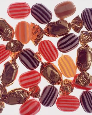
These are the lovely Grandparents, whom I pulled very strongly into the world of candy and chocolate. They may be poor, but I want them to look warm and friendly. To me, they're like the bowl of hard candy your great-grandmother always had sitting out on the coffee table. Here is my color inspiration:
Every time I think I'm getting good with markers, I either screw up something really badly (which I did in the case of Grandma Georgina, but fixed) or figure out a new technique that I needed three sketches ago. I figure though, that this is a lifelong process and I'll look back at these sketches a year from now and laugh at how much I didn't know.
Thursday, April 29, 2010
The Return....OF KYLE!!!!! AGGG!!!
Hey friends! Sorry I've been away for so long...its been way busy at work and with gearing up for the Summer...
Anyway, spe aking of Summer, that's the subject of my post today. I'm going back to Great River Shakespeare Festival (www.grsf.org if you're interested) where I'll be assistant designing the costumes for Othello, designed by Devon Painter, and the "Design Coordinator" for a musical called The Daly News. Its basically a re-mount of a production done a few years ago, but we are re-imagining a few things. Its a really lovely show with three actors that play lots of characters. Things move really fast so the characters need to be easily identifiable and quick to get on and off. It lots and lots of hats and coats. I'm only rendering things that are different from the original production.
Martin is the patriarch of the Daly family (he's played by the playwright, Jon Daly, who also happens to be his Grandson) whose children have all shipped out to fight in World War II. Every week he compiles all the letters that he gets from them and adds news from the home front into a news letter called "The Daly News" and sends it out to his kids to keep the family in touch.
The base costume for all the actors is a shirt and pants. In the past production he wore a cardigan and spectacles, which he's wearing here, but I'm getting new ones rather than renting them. There were issues with the fit of the cardigan in the past production, so I'm buying two sizes and seeing which fits Jon the best.
Shatzie is M artin's wife. An apron has always been used for this character, but was far too full and frilly in the past production. I found a really lovely apron in my research online and planned on building it. AND THEN I found the pattern in stock at work...I was so happy. We'll have to scale the pattern up to actually fit a man, but its a start!
I have a few more sketches to do...I'll post more as I get them done. I'm using markers for the first time in years so I'm doing lots of playing...its hard to get may hand used to the markers after being so used to a paint brush, but the markers go so much faster and considering that I leave for Winona in exactly one week, I need all the speed I can get!!
Anyway, spe
 aking of Summer, that's the subject of my post today. I'm going back to Great River Shakespeare Festival (www.grsf.org if you're interested) where I'll be assistant designing the costumes for Othello, designed by Devon Painter, and the "Design Coordinator" for a musical called The Daly News. Its basically a re-mount of a production done a few years ago, but we are re-imagining a few things. Its a really lovely show with three actors that play lots of characters. Things move really fast so the characters need to be easily identifiable and quick to get on and off. It lots and lots of hats and coats. I'm only rendering things that are different from the original production.
Martin is the patriarch of the Daly family (he's played by the playwright, Jon Daly, who also happens to be his Grandson) whose children have all shipped out to fight in World War II. Every week he compiles all the letters that he gets from them and adds news from the home front into a news letter called "The Daly News" and sends it out to his kids to keep the family in touch.
The base costume for all the actors is a shirt and pants. In the past production he wore a cardigan and spectacles, which he's wearing here, but I'm getting new ones rather than renting them. There were issues with the fit of the cardigan in the past production, so I'm buying two sizes and seeing which fits Jon the best.
Shatzie is M
 artin's wife. An apron has always been used for this character, but was far too full and frilly in the past production. I found a really lovely apron in my research online and planned on building it. AND THEN I found the pattern in stock at work...I was so happy. We'll have to scale the pattern up to actually fit a man, but its a start!
I have a few more sketches to do...I'll post more as I get them done. I'm using markers for the first time in years so I'm doing lots of playing...its hard to get may hand used to the markers after being so used to a paint brush, but the markers go so much faster and considering that I leave for Winona in exactly one week, I need all the speed I can get!!
Subscribe to:
Posts (Atom)