Monday, October 18, 2010

Rachel 10/18/10


This rendering is of a barrister and a cartographer, who are supposed to be creepy ominous characters. I'm very excited about the freaky eyewear for the cartographer. Whoop whoop for the loupe!

Sunday, October 17, 2010

Rachel 10/17/10


At one point in this play, a small boy named Albert and his mother approach the protagonist, Louis de Rougemont, in the streets and are clearly big fans of his memoir (which has been published episodically in a magazine to great acclaim, then released as a book). The boy is super-excited to meet him and asks Louis to sign his toy boat. Later when Louis' reputation is in question, Albert denounces him as a fraud.

The players portraying both roles have to quickly become the characters and just as quickly assume other roles, hence the pieces creating them being limited to a hats and a sailor-like neckerchief.

Pencil, ink pen, marker, Photoshop.

Saturday, October 16, 2010

Rachel 10/16/10


There's a whole crew of a ship in Shipwrecked! (which should come as a surprise to exactly no one), and here's a rendering showing the captain, Jensen, and one of the sailors. For these, i have a couple of research pictures to share, because i think they're particularly useful to look at in context.

First, Captain Jensen: in talks with the director, he had a very strong image of Captain Jensen as being like Captain Haddock from Tintin. The cap and the peacoat and a turtleneck sweater are taken straight from that character's iconic look.

With the sailor, he's meant to be one example of what the crew will look like, which will be composed of two players and three Foley artists (who are normally off to the side making the sound effects in view of the audience but not onstage, but in this scene will join the players for a large crowd effect). In thinking about how to dress the collective five Sailors then, i'm going to be choosing pieces that evoke this research image:

Friday, October 15, 2010

Rachel 10/15/10


There will actually be three Prospectors, but they didn't all fit on the size paper i had. Presume that the third will fit with these two as a sensible set of people. At this point, I'm really into this rendering process on this show, loving the opportunity to draw the same performers over and over in different characters! Can you track who's playing what? (Obviously the dark-skinned female actor is easy to track, being the only black woman and only person with dreadlocks.)

Same as the rest, pencil/pen/marker/Photoshop.

Thursday, October 14, 2010

Rachel 10/14/10


This rendering illustrates how Players in a stock base costume (trousers and shirt) might add pieces (hats, coats and stoles) to briefly "become" society women and upper-crust pedestrians in London.

This is one of a series i'm doing just to show the looks for various add-ons, but no one's draping from these renderings.

Same as the rest in this series: pencil, ink pen, marker, and Photoshop.

Wednesday, October 13, 2010

Rachel 10/13/10


At the end of the play in Shipwrecked!, a group of scientists and academics surround the main character and bully him about his story, saying they can prove he's lying. So, they're going to be some scary intimidating academics, and they're going to wear those creepy clear masks that are vacuformed into face-shapes, but which really distort your features. I think people mostly rob banks in them.

So, this rendering is meant to represent that collective of academics and scientists, what their add-on pieces might look like (robe, mortarboard or tam). THese will be pulled, rented, or purchased costumes so no one is draping or patterning from this sketch.

Monday, October 11, 2010

Rachel 10/11/10


This past weekend, i went again to the "Drawing in the Galleries" event at the Ackland Art Museum. Basically, once a month they have an open drawing session--you show up with paper and dry media, they give a talk about whatever the chosen subject is and how it fits into its larger exhibition, and then we all are given chairs and allowed to draw it for 2 hours. It's free, and a great way to just draw for the sake of drawing.

I've only been one other time (when i drew the Bishamonten statue i shared here), but i think i am going to make it a regular thing whenever the tech schedule at work permits--i love the opportunity to draw with others, to discuss afterward the challenges the subject permitted, to draw something akin to a live model, but yet so different, and the way that people visiting the museum otherwise react and interact. People come into the gallery we're in and look at our artwork, talk to us and ask questions, especially kids, which is always fun.

So, this week we were drawing "Leon," a life-size sculpture of an American Marine in the exhibit Counterlives, which is part of a trio of exhibits built around a recent acquisition of a bunch of Andy Warhol's Polaroid portrait photography. The sculpture was made by an artist named Oliver Herring, who is based in Brooklyn but has visited our campus before to do one of his performance art happenings called a TASK party.

Herring's sculptural work is carved in foam and collaged over its surfaces with photographs, so this life-size figure of a soldier reading a field triage manual weighs next to nothing and is covered in photographic prints to create its surface detail. Brandeis has a good closeup of the surface of the sculpture from when it was shown at the Rose.

I treat these drawing classes as an opportunity to practice costume design sketchwork, so rather than attempting to draw a perfect capture of the piece of art, i use the art as inspiration for how i might draw a costume rendering of a character for whom the artwork might serve as a research image. So, for Bishamonten, i chose colors for his articles of clothing even though the original was monochromatic; for Leon, i used it as an opportunity to address representation of pattern (the pixelized camo fabric of modern field uniforms) and draw a fairly straightforward costume in an interesting way--the foreshortened pose and the book as a prop.

In real life, i probably wouldn't take the time to do a rendering for someone who was playing a contemporary US Marine like this unless my contract stipulated that i had to draw every character look, regardless of whether a shop were making it to order or not. This costume would be completely purchased, and the look of it easily communicated to a director and design team with a research image rather than a rendering. So, it was cool to draw in this context as purely an exercise.

He's done with pencil, ink pen, and marker.

Oh, and in "small world" coincidences with respect to the art world, they had in this same gallery a photograph of Pieter Hugo's, an African photographer whose portraiture depicts Nigerian film stars in unusual iconic costumes juxtaposed against backgrounds of normal places in Nigeria (street scenes, forest/jungle locations, neighborhoods in cities, junkyards, etc).

In doing the research for Shipwrecked!, i'd been looking at his photography as a visual reference for ways in which we might imagine our cross-cast players looking when, say, we have a young black woman dressed up as an old white barrister. Since all the characters are played by only three people, the performers are going to frequently cross gender and cultural lines, and occasionally even species lines (one will play a dog for a while), and Hugo's work was my reference for how that could be done in an interesting and thought-provoking way. So, cool to see one of his photographs right there in the museum!

Sunday, October 10, 2010

Rachel 10/10/10


It's Queen Victoria! There is a prelim for this which, paging back through the blog, i see i didn't share back when i drew it. Maybe i'll post it later for comparison.

I did share the quick sketch i did of Shrek's Lord Farquaad, a fairly well-known short-statured character played on the actor's knees. Queen Victoria is another one of those. In Shipwrecked!, part of the play's structure calls for all roles to be played by the same three actors, so the production team has to find a way to have a male actor play this role believably, comically, or both. Knee-walking to evoke Victoria's short stature is the way we're going. She'll be played by a male actor who stands over 6' tall, so he'll have kneepads on and become little short roundy old Victoria.

Another challenge with this costume is, it's a super fast quick change, so the whole transformation has to happen super-speedily. The wig/veil/crown will be constructed-in-one as a headdress, and the body padding/bustle structure/gown will also be all connected together as well (though separable for cleaning purposes). I'll probably be writing up the production process on this garment over in La Bricoleuse once we begin construction, because it's going to be so intricate and interesting.

Friday, October 8, 2010

Rachel 10/8/10


Yet more of Shipwrecked!

At one point, the protagonist, his dog, and the aborigine family who adopt them are set upon by rival tribespeople in war masks. This rendering shows those mask designs. We've already begun making them, and they are 3' tall!

I love this rendering because of the active poses, which are taken from photographs of actual aborigine warriors in regalia.

Pencil, pen, marker, and Photoshoppage.

Thursday, October 7, 2010

Rachel 10/7/10


This is Louis de Rougemont's second look, which i shared last month in preliminary format. Again, i had a cast list when i drew this one so the rendering has become more "realistic looking" without really any change in the design of the costume itself. Pencil, ink pen, marker, Photoshop.

Wednesday, October 6, 2010

Rachel 10/6/10


Here's the final rendering for the character of Louis de Rougemont at the top of the show. Our cast list came out yesterday morning, and i did his rendering yesterday evening, so i was able to take into account the fact that the role will be played by Scott Ripley, and try to make the sketch resemble what he will look like in the costume.

It's cool to contrast this final sketch with the sketch i did for prelims on this show, posted back in early September. It's still the same basic costume idea, but i feel like the final really communicates the costume a lot more clearly.

Like yesterday's sketch, this was done with pencil, ink pen, markers, and Photoshopping.

Tuesday, October 5, 2010

Rachel 10/5/10


So my show at work is going into preliminary production, which means i can share some final renderings. This one is of two characters who are aborigines who wash ashore on a deserted island, inhabited only by a man and his dog. I shared the prelims back in September, but now i've moved on to doing final renderings so it'll be cool to look back and contrast the difference.

In this show, there are a couple of Players who do multiple roles, so this rendering shows two of them in their base costumes, after adding wrap garments in custom created batik fabric to adopt the roles of Gunda and Yamba. Yamba carries a doll which represents her brother, Bobo.

This sketch was done with a combination of pencil, ink pen, marker, and Photoshop.

I've begun to blog about the technical process of the batik design in my costume craftwork blog, La Bricoleuse, which you can read more about here, in a post chronicling the design process of the pattern.

Sunday, September 12, 2010

Rachel 9/12/10


Another prelim for Shipwrecked, this one is for Bruno the Dog. One of the challenges of this play for the actors is, they play a huge range of characters so the more theatrical the character, the more dependent its realization is upon the performance. Though we could build an incredible dog suit or mask or whatever, that's not in the nature of the play, and it's not something that there's time to don or doff even in a quick change.

So, in this rough sketch you can see that Bruno is largely going to exist in the actor's performance, with his physicality only suggested by a bag-hat reminiscent of little pup ears and possible a tail rig (though that's on the table for being cut, since this performer has to drop in and out of Bruno and do other characters interspersed.

Thursday, September 9, 2010

Rachel 9/9/10


This is the second preliminary rough for the character of Rougemont in Shipwrecked! At the end of the play, he strips down to his bathing suit and rides a giant turtle. This costume has to be able to underdress his prior costume, and is meant to be pretty much an exact copy of this period photograph of a bathing costume.

Saturday, September 4, 2010

Rachel 9/4/10


This is the first in a group of prelims i'll share here, for an upcoming production at my theatre, Donald Margulies' Shipwrecked! An Entertainment. I drew them a while back, but didn't want to share them in this blog until i had some feedback from my director and had shared them with my Costume Director and shop manager. But, now everyone's seen them, and they aren't the actual final renderings either, so i feel okay about sharing them in here.

This is the character Louis de Rougemont, the narrator and star of the play. The play is him telling the story of his life, acting it out with the help of some Players. It's an incredible tall-tale about how he left home as a boy, survived a shipwreck on a deserted island, was discovered by some tribespeople, fell in love and married a woman from the tribe, etc etc etc. The story spans the time from 1860-1900, and the Player company all start the show as modern-day at the top, assuming period characters onstage. Rougemont though is clearly a dude from 1898, as you see here.

The play is based on a real guy (this photo here is the actual de Rougemont), who told his amazing story in a serial publication to the delight of Victorian England, and subsequently was disgraced as the Royal Academy denounced him as a liar and fraud, much like the many literary frauds who have come to light in the past few years (James Frey, JT Leroy, Nasdijj, Margaret B. Jones, etc).

This sketch pretty much is piece for piece the real de Rougemont, down to the three piece suit and fancy moustache. I did a series of background prints in Photoshop for these sketches (which are, again, prelims, not the actual renderings at all) using map elements, since one thing this blog has done for me is revealed how much i love creating sketches on an interesting background field.

I did the sketch first in a very light 2H pencil, then went back into it with a range of colored ballpoint pens, being inspired by the engraved political cartoons and book illustrations of the period. I may continue with this method for the "real deals," or i might get some actual nib-point pens and colored inks for the real ones. Haven't decided yet.

Regardless, here's Louis, and the ball that is Shipwrecked is in play!

Saturday, August 14, 2010

Rachel 8/14/10


This morning i went to an event hosted by the Ackland Art Museum in Chapel Hill, called "Drawing in the Galleries."

Basically, it's a two-hour event (10am-noon) that's essentially an informal drawing class, and it's free. You show up at 10am with your paper and dry medium of choice--pencils, crayons, etc.--and are given a folding chair and ushered to a particular focus artwork. The host explains a bit about the work of art, its history and relevance with respect to the exhibition as a whole, and then off we go, drawing however you wish for the next two hours. I guess you wouldn't have to do the focus work if you didn't want to, but it was cool to draw right along with the 8-10 other people there.

So today's work was a part of the exhibit Fortune Smiles: the Tyche Foundation Gift--it was a 14th-century statue of Bishamonten, one of four guardian deities in Buddhist tradition.

The statue is monochromatic--all black--though at one point it was painted brightly. He held a staff at one point (now lost) in his right hand and holds a stupa in his left hand. He was standing on a struggling creature who represented the demon of Ignorance, but i didn't have room for him on the page, and wanted my piece to be more like a costume design rendering for a character called "Bishamonten" than a depiction of the statue itself.

This sketch was done with colored pencils and regular pencil, over the two-hour session. When the session stopped, i stopped, though i think for stage i'd go back and do a final black ink layer of outlines and some shadow-hatching.

I think the most challenging thing about doing this sketch was trying to figure out what layers of his attire matched up--what part of the bottom were the sleeves attached to, which were part of the suit of armor, etc., since the source piece was all one color. I think it's pretty clear though--i could generate a pieces list for this character based on this sketch now. It'd be something like this:

  • Armor: gorget/pauldrons
  • Tabard
  • Long robe with pointed sleeves
  • Belt with mask-like buckle
  • Sash and overdrape
  • Tiered-blousant trousers
  • Turned-up-toe shoes
  • Burning halo of fire


Lots of cool crafts for Bishamonten here! :D

It was a really cool event and i will definitely be going back for future sessions! I may also go sometime when they are not having the formal event, to see whether i can just sit and draw some other artworks in a similar fashion. It was great to draw from a source other than a photograph!

Sunday, August 8, 2010

Rachel 8/8/10


I've recovered from a month in Mexico, i'm back on contract at work, and it's time to get sketching again!

This is a quick rough of the character 'Lord Farquaad' in Shrek: the Musical, taken from this press photo. It's roughed out first in pen, then markered in basic color.

I hate the hands, but that's what i get in a rough--hands are my least favorite part of the human body to draw. Also, his face totally looks like Michael Jackson to me. But i guess that kind of works for Farquaad.

Without going into too much detail as yet, I've got a project on the horizon in which i need an actor to play a character on his (super-padded) knees, like Farquaad is played.

I thought it would be a good initial exercise to draw Farquaad from a press pic, but attempt to show in the rendering a hint of where the legs/knees hit inside the costume. Farquaad has a puppetty prosthetic short-leg-rig, and the actor's legs are hidden by black pants and a full cape with a "cape petticoat" to keep it hiding the shins/feet.

Sunday, July 18, 2010

The Lion in Winter #5, 6, 7

I finished the rest of my Lion in Winter drawings this weekend...


This was a really fun project. I really liked all of these sketches before I added color and now I like them even more. The markers were really fast and easy to use and pretty much look like the renderings that I do in acrylic paint. I wouldn't say that I'm a complete convert, but I'm sure that when an appropriate show (or any show) comes around for me to design, I'll use markers! Any constructive comments would be very much appreciated!

Thursday, July 15, 2010

The Lion in Winter #4

I had to play with the contrast and brightness quite a bit to make this sketch look more like it really looks on paper. The past ones look much brighter than they usually are.

I really like this sketch. I'm quite proud of the face (the proportions - not so much). I have always had a hard time drawing faces in 3/4 view. This one, though, is one of my more successful attempts!

Richard the Lionheart is Henry's second son. His older brother is dead and he is now heir apparent to the throne - at least in his and Eleanor's minds. He is described in the play as a rugged, manly, handsome soldier. He is strong and tough, overly masculine. he has had an overly close relationship with Eleanor in his youth. It is also implied that he is a homosexual by Philip.

Mmmmmhm...a ruggedly handsome gay prince. Who doesn't love that?

Wednesday, July 14, 2010

The Lion in Winter #3

More marker adventures...The scanner has done funny things with the color on this one. The pink in the gown is more greyed in the actual sketch. The contrast is a little heavier too. Not too bad though...

Alais Capet is a French princess who has lived at King Henry's English court as part of a political deal between England and France. She is supposed to marry Richard, Henry's eldest son, but has been in an adulterous relationship with Henry for years. She is young, french and beautiful - like a ghost of what Queen Eleanor used to be.

I'm going for some bold colors in this production - colors that probably weren't around in the clothing of 1183. But these are royals - the characters are all larger than life. I'd probably also use some velvet which wasn't invented till the beginning of the 14th century and didn't appear in Europe till the end of the 14th century. Oh, well...I can do whatever I want...mmmhm.

Tuesday, July 13, 2010

The Lion in Winter #2

I'm becoming more and more comfortable with markers as I uses them. I've always been a huge fan of Prismacolor's products - I have several large sets of their colored pencils and have used their pastels before. They have such great saturated colors. Sometimes, though, they are a little too saturated and bright.

For this character, Phillip of France, I wanted to use a bright color for his tunic. He's a King after all and a fancy French one - so I went with blue. Well that blue was a little too blue. Out came my old friend, French (HA!) Grey 20%. That solved it!

I made a mistake on the fur and hair, though. Not enough texture - I just used the fine point side of the marker - obviously not fine pointed enough! Fixing that in the next few...

Monday, July 12, 2010

Kyle Returns...its marker time!!!


Hello, Duckies!!! Its been a busy, busy, busy summer. I returned home to Knoxville last week from Great River Shakespeare Festival in Winona, MN, where I assisted the wonderful Costume Designer Devon Painter on a beautiful production of Othello and designed the costumes for a fantastic small musical called The Daly News (I think I put those sketches up before I left, but I can't remember!). I did the Daly News sketches in marker which I hadn't used very much before. I loved how fast they were, but I didn't do very much with them - no real blending or layering - so I though that now that I'm home and have some free-ish time I should work a bit more in the fabulous world of markers. I've had these sketches of The Lion in Winter, one of my favorite plays hanging around since before the start of this blog so I thought, "Hey, why not throw some color on these!"

First things first - I rarely color directly on an original sketch. I get freaked out that I'm going to mess up and have to re-sketch the whole thing. On these I just went for it. I did these sketches on smooth finish 100lb Bristol paper. Its pretty much my favorite paper - very good to draw on, especially with the hard pencils I like to use. The markers seem to work OK on it. It soaks in a little too fast, but, as I've been told by the Marker Master, Bill Black, "They are MARKERS! Treat them like markers - they'll never look like paint!". I'm slowly getting used to the fact that there will be some streaks. If I were to do these again I would do them in a paper with an even smoother finish and possibly some color.

I did quite a bit of layering to grey out the colors. I think that there are three colors of marker alone in the little bit of underskirt, not to mention the pencil on top of the marker. I've very quickly learned that the french greys are my favorite things ever. I'd love to get the full set - I've only got 20%, 40%, and 60%. Brick Beige is also amazing for skin tone - I need to get a few more skin bases though...not everyone is Brick Beige colored!

I like the sketch a lot. When I did them I was focusing on faces and drapery more than anything else - some of them are a bit out of proportion - especially some of the men you'll see later. I'll try to post them in order that I did them so you can see the progression of my marker journey. Its a pretty small show - only 7 characters, so I'll be done by next week and then see what I should do next...maybe color a different show. I'd like to get pretty comfortable with markers...while some frown on them, they are so easy and fast to use!

Wednesday, June 16, 2010

Rachel 6/16/10


Well, i've been on hiatus from sketching or typing much due to a bad flare-up of carpal tunnel--i've had sporadically recurring RSI in particularly my right wrist since 2005, and managed to aggravate it with a combination of intense periods of typing too much, writing longhand, and sketching, topped off with overly-vigorous bowling. (I wish i were joking.)

The main lesson here is, if you don't have RSI yet and you are a costumer, please be mindful of taking regular breaks and resting your hands and wrists, and don't ever work somewhere that won't allow regular breaks or makes you use ergonomically-harmful cutting equipment or table heights.

But, to get off my soapbox, i did a sketch today! I was literally about to climb the wall wanting to draw something, and i remembered something i did back when i first had the initial bout with this injury: left-handed artwork. (I'm a right-hander.) I did a couple of paintings that first time out with brushes stuck down inside a wrist brace, then some with my left hand. I thought, why not try that again?

So, i'd collected a couple inspirational images i wanted to sketch from of dancers, in keeping with my overall desire to work with drawing figures captured mid-motion doing expressive action. This drawing was inspired by an Oya orisha celebration dance done by the Afro-Cuban Arenas Dance Company. Check them out here (my lady is 3 pix down)!

Totally drew this with my left hand, first using a red ballpoint for roughing it out, then going back over it with a navy marker. I kind of wish i'd stuck with the thin lines and gone back over it with a black inkpen or really anything with a smaller nib. But whatever, live and learn, and i DREW SOMETHING and it doesn't suck, even left-handed. So, hooray.

Tuesday, June 15, 2010

Eric 6/15/10

Wow... so, it's been what?  Two weeks?  Eh, it's the summer.  I'm sorry for all of our dire-hard readers, but summer time in the theatre is rarely down time.

Here is a sketch from the Isaac Murphy play we're doing this fall at LCT.  I decided to only post one, but here is a link to the rest of the sketches.

This sketch is of one of the Gossip characters in the play.  It's a really interesting function for a character.  She drives much of the story through her rumors and exaggerations.  From her and others we learn about Issac's changes, his failings and his perceived successes.

As a concept, there are eight actors to accomplish many characters.  They never leave the stage, and the shifts in characters are almost instantaneous.  Therefore, I wanted to create a world based on 1890 silhouettes, but simplified and layered, so that we can move through the costumes easily.  In some ways, this is much like the design I did several years ago for The Laramie Project.  Same deal: eleven actors play MANY characters, all within moments.

In terms of sketching, I'm decently happy with the work, but I'm seriously impressed by my own speed.  I'm still in my old mentality that a sketch would take me forever.  Now I'm knocking them out in fifteen minutes, tops.  Sure I could slow down and probably make fewer mistakes, but I'm enjoying the freedom of expression.

So, until next time my faithful readers (whenever that may be).

Tuesday, June 1, 2010

Eric 6/1/10

So, yeah,  I took some time off of the blog.  With the new job at LCT, I allowed myself a bit of a sabbatical in order to focus on the transition.  But now that it's June, and that I have two shows to get designed over the summer, it's high time to begin the sketching again.

Today I had my second design meeting for a new play by Frank X. Walker about the jockey Isaac Murphy.  What I'm exploring is a modernized 1890's silhouette that is stark, mutable, and simple.  My primary research image comes from the Kyoto book, so I don't have it scanned in yet.  But I also found this great image of Harriet Tubman, in a simple, strong silhouette.  That's what I decided to sketch tonight.

Well, it's not easy picking the pencil back up after an extended rest, I'll tell you that.  My hand is actually sore from the stress of gripping the pencil too firmly.  I think I made some proportional mistakes, and the face isn't a good likeness.  But, I'm relaxing back into my good habits, so too much pressure is a bad thing.

It's good to be back!  I hope I keep it up!

Friday, May 21, 2010

Rachel 5/21/10


I'm really stepping outside of my comfort zone today with this sketch of a ballerina.

First off, i have low confidence when it comes to rendering effective-looking ballet poses. I never took ballet, know little about it as an art form (despite having worked as a stitcher for two nationally-recognized ballet companies), and don't enjoy watching it. So, drawing ballet costumes is like the artistic equivalent of trying to catch fish with my bare hands for me.

And secondly, this drawing is huge: 2' x 3'. This past weekend i bought a Tiffany style lamp at an antique store and the shade got wrapped in these massive sheets of paper. I prefer to draw on 11" x 17" paper or smaller, so this was another challenging element. I taped the massive piece of paper to the door of my studio and drew on it standing up. This sucked, because it made the markers i used get streaky quickly as the ink ran down the wrong way inside thanks to stupid old gravity, and my arm got tired windmilling around drawing on a perpendicular surface. I'm still feeling the strain of an overenthusiastic bowling incident from last weekend, and this didn't help.

I hate this drawing. It's hard for me to see scale and proportion on a piece this size, so from a distance i see all these flaws like how weird-shaped her limbs are and how unappealing i find the line quality of pens i like when i'm using them on smaller pages. Still, it's good to push yourself outside of what's familiar, so i think this was a valuable sketching exercise. I think i'm going to just recycle the rest of the big paper pieces though and go back to my favorite scale. Bigger = not better in this case.

In the interest of presenting something i *am* proud of (by proxy), here's an image of the costume i was attempting to render here:


This tutu and ballet bodice was constructed by Amy A. Page, a recent (2010) graduate of the Costume Production MFA program in which i teach at the University of North Carolina at Chapel Hill. The ballet bodice and tutu are one of the collection of projects that constitute the masters thesis in our program. The head of the program, Judy Adamson, teaches the incomparable tutu production methods practiced by the recognized master of tutu construction, Barbara Matera.

The students propose a tutu design for approval and then construct it--sometimes they do it in tandem with a company such as Carolina Ballet, but this year the two grads selected independent designs of their own choosing. Amy's classmate, Randy Handley, made a tutu featured previously on this blog, the second sketch down in this post by Jen Caprio from back in January! I thought it might be a fun project to sketch Amy's "ice queen" tutu and bodice, and use it as an excuse to try rendering a dynamic ballerina pose--that way, both grads would wind up with their tutus on here.

In retrospect, i should have chosen just one challenge here, and done it at normal familiar dimensions instead of huge. Not only do i see scale issues with the dancer's limbs, but also in the scale of the motifs on the tutu plate. To attempt some objectivity, it's ok, but i'm betting this isn't one anybody wants for a portfolio. :)

Sunday, May 16, 2010

Rachel 5/16/10


I'm visiting my parents in east Tennessee, but I found a bit of time to sketch today while my mom read a book and my dad did some garden-puttering. It's possible that this is my last set of mask renderings. I'm fairly sure which six i want to do out of the twelve i've drawn thus far...

These are the Captain and the Doctor, aka Il Capitano and Il Dottore. I really love these guys! It's really cool how a lot of these stock characters have some conventional or standardized features, but are still so manipulatable in terms of imposing your own style on them.

Il Capitano is either proud/conceited or angry/piratical; i obviously picked the angry/piratical version. I'm envisioning his stache as being some kind of actual fur or hair so that it has some movement.

Il Dottore is based on the birdlike plague doctor mask in this case, but i also wanted to evoke the worried, befuddled old-man-like quality that some Dottore masks i've seen have. I'm undecided about his eyebrows--i've seen some great Dottores with fluffy fiber brows, which might be a fun element to add to him.

Now that you've seen all twelve renderings of these, which is your favorite?

Friday, May 14, 2010

Rachel 5/14/10


This may be my last one for a while, since as soon as i post this, i'm off to parts west for vacation and the SPESA Expo. I'm taking my sketchbook and pastels with me, as i'm hoping to finish preliminary sketching by Wednesday so i can start the maquette sculpting of whatever the final mask designs wind up being. I don't know whether i'll have time to photograph and write up any sketches i do between now and then though. We'll see.

These two masks are the Young Lovers. I'd been putting off doing them because i find the idea of their expressions hard to conceptualize--they need to be sort of blank slates, so the performers can indicate a huge range of emotions, and they need to be young looking, attractive-looking, perhaps innocent even.

For my own part, i also wanted their features and face-shapes to be as neutral as possible, so they could be worn by performers of any ethnicity or body-type without a disbelief-suspension issue of say, a mask with extremely bony features on a stocky or curvaceous performer.

I've seen a lot of these Young Lovers masks with the dimensional swirls on the cheeks, and i love that element so i retained it in mine. I also decided to employ a lip shape that feels more childlike than the angular peaked cupid's-bow lip shapes in many of my other mask sketches.

I am fairly certain these are two of the ones we'll actually be making; i'm considering hosting a poll over in La Bricoleuse to vote on the other mask styles, once i'm done sketching. That might be a fun way to bring some more community involvement into this project, soliciting input on the final grouping.

Wednesday, May 12, 2010

Rachel 5/12/10


Today's a weird one, inspirationally speaking. I had some vague ideas about wanting in my next pair of mask sketches to explore the ideas of suggested hairlines along the top edge, and whether incorporation of upper teeth could work. I also wanted some definite specific faces to influence the structure of the features.

I think it's fairly clear that the mask on the left was based on a young Billy Idol's iconic sneering expression and widow's peak. The mask on the right is a bit more obscure: it's modeled on Steve Buscemi with his buggy eyes and thin upper lip and receding-pattern hairline.

I'm happier with Steve as a general Commedia mask design--if you know it's based on him, maybe you kinda see it, but he could be any older character of whatever gender and could display a range of emotions; Billy is clearly and obviously Billy to me (does that make me old?) and less versatile of a mask. I am pretty sure i don't like teeth on character masks that aren't of the stupidity-as-comic-relief zanni variety, but i'm willing to be persuaded otherwise if any of y'all feel differently on that topic.

I know i'm really busting them out right now in terms of not taking much downtime between sketch posts; i'm trying to build up a cushion because i'm headed out of town on Friday for a book release party, then a family visit, then the SPESA EXPO 2010, so i'll be incommunicado for nearly a week.

SPESA proves to be pretty exciting--it's the Sewn Products Equipment and Suppliers of the Americas exposition, and will have miles upon miles of industrial sewing equipment demos, fabric and trim vendors, production companies and dye services, printers, mills, software developers, you name it! I've never been before, and am very excited to attend this one. I'll be reporting on it over in La Bricoleuse, which you can now like on Facebook if that's how you prefer to aggregate your blog consumption.

Tuesday, May 11, 2010

Rachel 5/11/10


Two more mask designs, again in oil pastel.

For the one on the left, i was going for an older female face, with a sort of wry happy expression. The one on the right is based on this really beefy bald man's face i found, in which he looked sort of ominous and sad.

I'm not as happy with either of these as with yesterday's masks--these look kind of superhero-ish to me. Or, maybe supervillainy. I saw Iron Man 2 yesterday so maybe that is subconsciously influencing my perception. I enjoy drawing these, and using the oil pastel medium, so i will probably keep doing them in variations on this theme until i get six i want to actually make for real.

I'm open to suggestion, if anybody's got a challenge for a facial expression or a stock Commedia character to render...

Monday, May 10, 2010

Rachel 5/10/10


Back to Commedia mask designs.

I did these two sort of intending them to be female characters, but they don't look particularly gendered at all. They're done in oil pastel on the same long sketchpad that i used for my prior mask sketches. I did a hint of a wearer's lip/chin in these, and i think they kind of help with scale.

I'd forgotten how much i LOVE working in oil pastel, how fast it goes and how awesomely blendable and stripped-down it can be. It really lends itself well to these Commedia mask designs, in that, i need to be thinking in broad expressive planes and shapes, but the blending and smudging properties of the oil pastels give the simple shapes a lot of depth and interest.

I was just sort of farting around with facial variations, but i like these two so much, they might actually wind up being two of the real deals. We'll see....

Sunday, May 9, 2010

Eric 5/9/10

After a wonderful weekend with my parents (and no, I couldn't talk Mom into sketching for the blog), I spent today working on the final sketches for my last LCT show, River Rat and Cat.  Since there are only three sketches, and I had all day, I thought it would be no problem to knock them all out.  WRONG!!!

I love painting in acrylic, but I forget how painfully slow I am with it.  If I were to be doing more of them, then I'm sure my pace would pick up.  However, I soon remembered how long it actually took me to paint my thesis project from UT, The Love of Three Oranges, especially since there were over forty of those.

But, I still find the whole process satisfying.  And since they're not due tomorrow, I can still get them all done on time.  What I like so much about acrylic is the opacity.  Since I'm a bit of a random thinker when it comes to my sketches, I tend to not always think "light to dark" as is required in watercolor.  With acrylic, your highlights can come last, and that's all right.  I also like the color saturation acrylic can afford.

Also, due to the tea dyeing, my paper is pretty warped, so it didn't scan well.

Here's to many hours of painting ahead!

Saturday, May 8, 2010

Rachel 5/8/10


It's Cyndi Lauper! Man, did i love her so much in the 80s. I remember saying to my mom that i was going to do my hair like hers, and her saying, "No, you're not." Guess that's perhaps part of why i spent the 90s with my hair every color of the rainbow.

I really was still feeling the "background inspiration," but all i could find in the house that had a decent value level of background noise was this page of classifieds. So, i thought about who newsprint reminds me of, and Cyndi Lauper came to mind and her excellent newsprint tutu from the "True Colors" video. She also was known for dynamic poses in her photo shoots, so i decided to go for her as a subject for today's sketch, which is based on this photo.

This one is about 95% colored pencil, 5% marker for the outlines and name label. I cannot complain about this sketch; i'm totally pleased with the outcome. So much so, that i might have to come up with some other appropriately zany 80s popstar to draw on some more newsprint...

Friday, May 7, 2010

Rachel 5/7/10


One of the projects i'm doing this summer is creating a set of Commedia dell'Arte masks. I've done a bunch of research and have planned the production calendar, spec'ed out the materials cost and labor estimate, and have verbal agreements with a couple of assistants for the matrix sculpting and actual production work. What's left to be done before we start is to settle on the designs for the masks themselves.

I was really inspired by the mask designs of WT Benda (whose work was exhibited at USITT this year) and have always admired the work of Alyssa Ravenwood in this area. So it was with those two artists' masks in mind that i began these ultra-preliminary sketches.

This sketch is the very first two hints of breaths of ideas, absolutely not to be considered the final designs at all. I wanted to try drawing two front-view mask concepts, an angry character and a worried/sad character, using some of the conventions of Commedia mask design--deep lines of hyperbolic expression, planar/bulbous feature exaggeration, and monochrome colorization.

I am undecided about whether i think it's helpful or distracting to draw a human lower jaw into these designs, as that's not part of the mask itself. I'll do that for the next set and see how i feel, but i'd love input as well. If you were sculpting half-masks from a design rendering, do you want to see the face of the wearer under there in the design, or just a couple of style marks like a chinline and lipline?

For an actual rendering (further down the road) i'd use this long sketchpad to create a single mask design, front view on the left and profile on the right, since i'll have two other sculptors on this project in addition to myself, and want to make sure we're all working on the same metaphorical page, so to speak.

Pretty excited about this project!

Thursday, May 6, 2010

Eric 5/6/10

Since I had to come home and let the garage door repairman in, I decided to get my sketch done.  I can't complain that he's taking a long time, especially since I had a chance to get sketched.

One of my favorite costume design history/art books is The Elegant Beast.  My random explorations this week suddenly reminded me of this book.  I think this is why I've been having so much fun with these sketches.

Today is a Kitty Samurai.  Why?  Because Amy suggested a samurai, and I love my four darling, angel cats.  I don't think I did as clean of a job as I have done this week, mainly because I wanted to make sure I got it done before I had to head back to work.

Tomorrow my mom and dad are coming to visit for the weekend.  Whether she knows it or not, I'm making Mom sketch and post with me tomorrow.  Get ready, momma!

Rachel 5/6/10


Today's contribution on my behalf is back to the computer. This is a sketch from a paper project of Lend Me A Tenor, from something like 1994. The originals weren't colored in, so much like with the Mrs Linde/Doll's House sketch, it seemed like a good candidate for messing around with digital color application.

This is Diana, the sex-kitten opera diva, in her evening ensemble. She's supposed to seduce Tito in this dress (though if you know the show and its mistaken identity plot snafus, she actually throws herself at three different characters, all wearing identical Othello costumes), so it had to be drop-dead sexy, but Diana is also a fairly heartbreaking character, because her promiscuity is linked to her tenuous self-image.

She has the typical dichotomous nature of narcissism/self-hatred that plagues a lot of famous aging stars. She uses young lovers like tissue to big herself up, even as she fears getting older and losing her sexiness; she wants her big break into international opera, and believes this may be her only chance for it, to seduce Tito and be catapulted into fame on his shirttail, so to speak. So, she has the absurdly hourglassed boned/girdled understructure of 1950s wiggle-dress wearers, but she's chosen a soft sea green color to contrast with how scarlet-hot she comes on to the mens in this outfit.

So, the sketch. It's okay--i was able to use the color palette i wanted, and i think i conveyed tolerably well that the entire upper portion of the gown is supposed to be made from a shiny satin, while the skirt is piles of diaphanous net with some sort of beaded tutu-plate-esque applique at the join between gown/skirt.

But, after the past few days' worth of paper sketching, i hate this. It feels dead to me. I realize that i can get better quality work (meaning, less pixelated line quality) from more sophisticated image programs other than Paint. Trouble is, the computer i have Photoshop and Illustrator on isn't this tablet computer (laptop with a screen that flips, not a peripheral tablet i could use with other computers i don't think?), and the software's work's, so it's not like i can get it installed on this borrowed computer of my father's.

Perhaps i will invest in the peripheral, and return to digital sketching later in a better program context. For now though, all my past few days' worth of marker renderings have served to do is make me want to do more analog, and chuck digital exploration for the time being.

Wednesday, May 5, 2010

Eric 5/5/10

I went to Centre with an amazing talented artist (well, many, many talented artists for that matter) named Lisa Brown (only one was named Lisa Brown, the others had different names).  You can check out some of her work here.  I was always in awe of how amazingly well she could draw.  Lisa had a fabulous knack for drawing her friends in both human and animal form (I was a Gay Pride Lion in some of her sketches).

Anyway, so when I asked for random ideas to draw, Lisa suggested a dragon.  Since her avatar/alternate reality/fantasy cartoon character is a dragon named Wertle, I had to pay homage to Lisa by drawing Wertle as a lady in waiting.

I have to admit that it's really intimidating to imitate an artist whom I know and respect through the very medium in which she excels.  Wertle is made of simple lines, but Lisa's ability has always been to take those very simple shapes and create instant, likable, and expressive characters.  This is something I am trying to improve upon in my own work.

The dress I used as inspiration came from a 14th C. French engraving called The Suicide of Lucretia.  In the work, Lucretia is stabbing herself and ruining her lovely gown. I thought it was a bit too much to kill off Wertle the first time I drew her.

I plan on keeping up with the random sketches.  Although, I think I like drawing real people with fantasy heads.  Not gonna lie, but I am sort of in love with my sketch from Monday.

Rachel 5/5/10


In keeping with the theme of using highlighter pens, Sharpies, and interesting cardboard salvage, here is a design rendering for the character of Lydia Languish in Sheridan's The Rivals.

This background is from the packaging for a bicycle helmet, and much like with the Yoox box i used for the Hair designs, i couldn't bring myself to throw it away. Unfortunately, there was only the one piece of the box big enough to draw on for a rendering, so this will likely be my only sketch in this series.

As with the Hair series, i've been looking to these projects as straight-up rendering practice rather than exercising design choices. This one is based on the beautiful photograph of 19th century actress Elsie Leslie in the role, taken by a woman i truly admire, pioneer photographer and milliner Zaida Ben-Yusuf.

I became aware of Ben-Yusuf when doing some research into the documentation of historical millinery methods, as both she and her mother Anna Ben-Yusuf wrote extensively on the methods of construction of late 19th century hat styles. If you are interested in learning more, start with Frank Goodyear's Zaida Ben Yusuf: New York Portrait Photographer; and, many of you probably already have seen her mother Anna's book Edwardian Millinery. They both were lifelong milliners and millinery instructors, in addition to Zaida's work as a photographer and travel writer. Fascinating ladies!

Anyhow, Lydia's impulsive and silly, so she's got these pink and orange value levels. I deviated from the original costume of Elsie Leslie's by making her sleeve ruffles pleated, and making the fabrics used in the skirts and overrobe crispier and loftier. Leslie's underskirt looks to have some kind of delicate embroidered net or lace in a knee-deep ruffle, and i hate cutting the lower half of the body off there with a horizontal line, so i went with a plain wide striped taffeta. The overrobe is some kind of large scale rococo brocade, like the motif of the background print.

Also, what i wouldn't give to make this hat. I wonder, now that i consider it, whether Zaida didn't make the one in the picture. I have NO documentary evidence to confirm it, but i'd be surprised if she didn't do stage millinery for the actresses whose portraits she made.

This one was a great time to draw. I'll be moving on to something else...what, i don't know. I realize i got all wooby and sentimental yesterday about saying goodbye to Hair, but today, i'm all, "Whatev, this is good because it's forcing me to be detached from my subjects." Maybe that's just my mercurial nature. So we'll see, what will tomorrow bring?

Tuesday, May 4, 2010

Eric 5/4/10

The randomness continues....

Last night, Rachel suggested that I draw around the idea of hillbilly opera.  I loved that so much, I just had to do it.  I took the classic version of Brünhilda and took her to the hills.  Instead of horns, she wears a helmet of Bud Light bottles; instead of a shield, she wields a might box of Pizza Hut.  Her full length skirt is a pair of torn jeans that emulate a skirt.  So on and so forth.

I'm totally on board with the random and weird right now.  It's keeps the drawing fun, fun, fun!!

If any of you readers consider yourself a Hillbilly and find this offensive, well, I don't know what to tell you.  I know I did nothing but an overlapping smear of stereotypes.  So for that, I hang my head in shame, shame, shame.

Rachel 5/4/10


Thus ends the saga of Hair, with a doubled-up rendering of the characters of Claude and Berger.

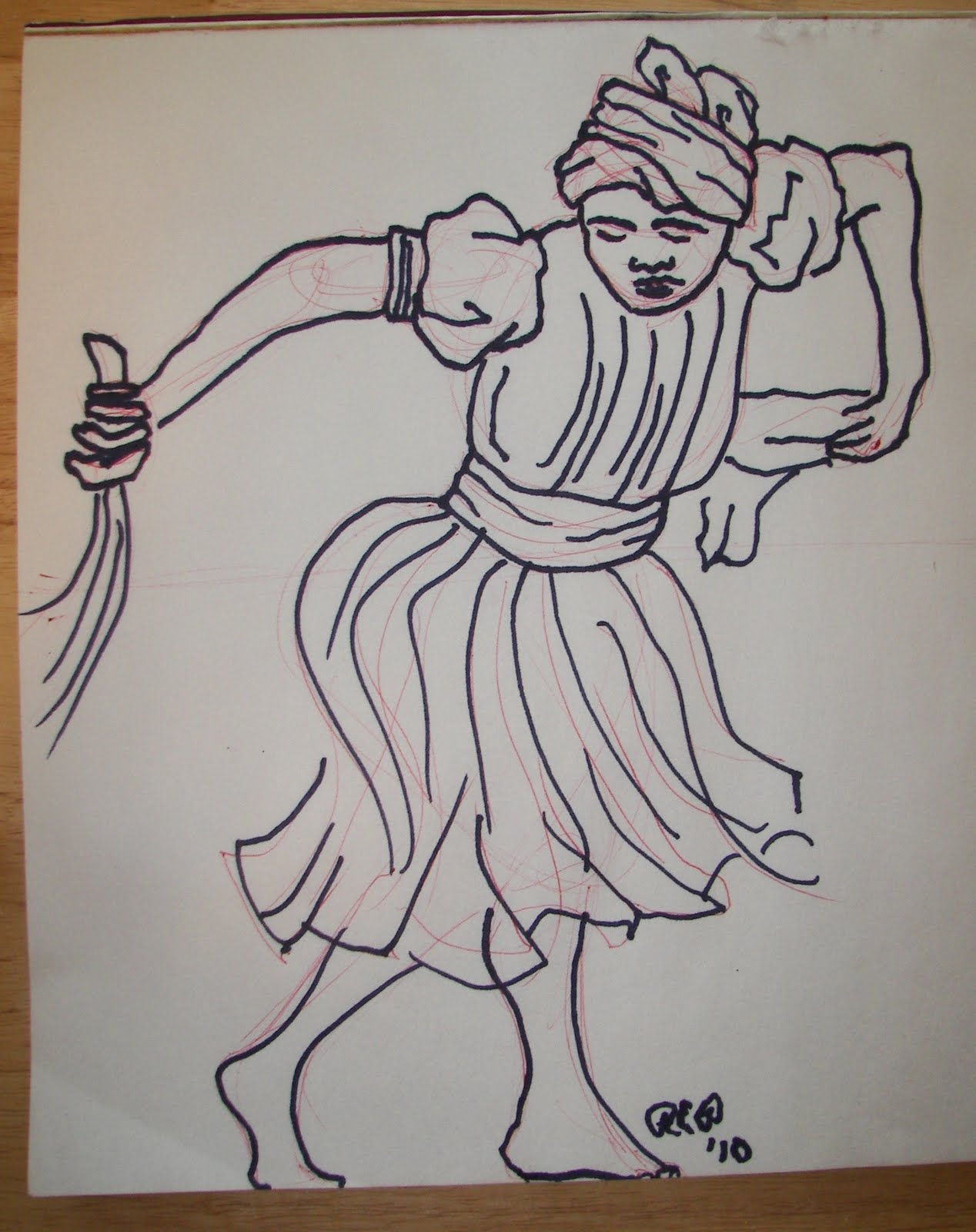
As with the Dionne rendering, i approached this one as sketching practice rather than design--it's been a long time (like, 15 years) since i drew two characters in this kind of OTT musical-theatre ack-shone pose. Literally every rendering i have done in the intervening years has been single-character in a fairly sedate "drama" pose. So, these are essentially Michael McDonald's costume designs for these characters in the current Broadway production (link goes to the reference pic i used to create the sketch).

Again, my thinking is that, because Hair is a show that I can really only envision in terms of being serendipitously designed/coordinated--largely shopped/altered, found/thrifted--just by its very nature, I've been approaching the renderings as characterization guidelines rather than as something i'd hand to a shop foreman and expect people to drape right off them. (Though, arguably, someone could sit down and pattern these two men's jeans from this sketch.) In fact, i could probably spool out some elaborate art-language justification for why, in homage to the values of the script and characters and historical subculture it dramatizes, that production method is imperative. But, that's wankier than i intend to get at 8am. Imagine it in your minds, that i have done that.

These boys are green, partly because that was the color i didn't use for Jeanie and Dionne's renderings, but also because they are so full of life. I'm happy with almost everything about this sketch--the figures, the composition, the cartoonish style, the way the background works with the layout. If this were a real show (and i had infinite supplies of these boxes for renderings), i'd redraw it so i could rework Claude's facial hair to be a bit less D'Artagnan-y, but when you work solely with marker, there's no going back.

The show as i read it is really about Claude's tragic arc--he's this totally confused suburban kid that i read as being on the gayer side of bisexual, crazy in love with Berger and also crushy on Berger's sort-of-girlfriend Sheila, both of whom are willing to indulge in free-hippie-love encounters with him on occasion, but see him only as what kids these days call a FWB. The way i interpret the script, he then essentially gets drafted and sent off to Viet Nam to take part in the horrific war and ultimately die (though i think you can argue that is "just a bad trip" and doesn't really happen to him, too).

Berger is this grunty sex-driven hedonist, whom everyone in the entire cast has probably hooked up with at one point at least. He's massively charismatic, good-looking, loud, confrontational, but not cerebral; he's part of this movement because he can drop out of school, be an asshole, do a bunch of drugs, live in the park and get laid all the time, not because he actually cares about peace, love, and understanding. Claude is his best friend, inasmuch that he has one, and he'll "do it if it feels good" with Claude, but doesn't have the significant depth of romantic love that Claude (as i see it) feels for him. Berger cares about Berger.

I chose this pose because i feel like it illustrates that dynamic between them really well, yet also conveys the whole exuberant-hippie-vibe of the show, in that "We just got finished singing 'I Got Life!' OMG Yay!" sense.

It's funny, but i really feel like this whole exercise of doing a set of renderings entirely inspired by a trash-picked cardboard box has been one of the most creatively freeing experiences of the past couple years.

Because what i do in 90% of my career is production, the creativity i exercise in that realm is within a set of guidelines--silhouette, color palette, fabric choice are all handed down from the designer, and my creativity is exercised in translation of the rendering to reality. In La Bricoleuse recently, i said "i'd liken production artistry to writing a sonnet--you have a set form and a rhyme structure in which you exercise your creativity. Design is free-form verse. Both are interesting exercises in the production of art, and stretch the mind in different ways." Whenever i switch back to design work after a long stretch of production, i'm initially panicky, like, "WHAT DO YOU MEAN, I DON'T HAVE TO USE IAMBIC PENTAMETER AND AN A-B RHYME SCHEME?!" And then, in short order, i remember how to swim and i'm good. (Hi, mixed metaphor to the max.)

I will say, one weird thing about participating in this blog is, this is where these things stop. I've done all the renderings for Hair that i intend to do...and now i'm on to something else. There's no cast to meet or design meetings to attend or color palettes to settle on or shopping to be done or shop to work with. I don't get to work with a whole creative community of people to pull these characters off the page and give them life. And, that makes me sad, in a sense. I want to see these scenes happen, laugh and cry and marvel at how it's exactly what i envisioned but so different as well, suck up the free wine at the opening gala and congratulate the guy playing Claude who of course looks absolutely nothing like the rendering when he's out of costume, all that comes AFTER the sketching.

I've talked with some designers who think that's paradise--"If only i could just sketch all day, create the designs *I* want and not have to deal with actors and directors and their messy opinions, and drapers and tailors who care about what fabric can actually do in the real world," that kind of thing. And i just think, really? Why aren't you an illustrator then? Because all of that, which you find so frustrating, is the very life's blood of theatre, and exactly why it holds a mirror up to life itself. It's not about a perfect hermetically-sealed easy isolated antiseptic creative bubble--it's messy frustrating beautiful angry gorgeous life.

Which is not to say that you don't on occasion want to give every other person on the creative team, in the shop, or part of the cast the vigorous angry double-middle-finger. And maybe that's the place they're coming from when people say that about the ideal design bubble. But i digress.

I'm done with Hair, but i do have another found background for a sketch that i'm excited about, so i'll do that one for tomorrow. It is drastically different from this series, so it'll be fun to change gears in a huge way for it. Then maybe i'll pick that tablet computer back up...

Let the Sun Shine In!

Monday, May 3, 2010

Kyle 5/3/10

We hello duckies...
I'm just gonna go ahead and post the remainder of my Daly News sketches because that may be the last chance I have to post till I get up to Winona and settled next week (I've started packing tonight and my place is a MESS!!)...

Dave is the youngest son in the Daly family. He sings this great song about being left behind and not being able to join in the fighting because he's too young. I found a great source to get a custom Letterman sweater made in the correct school (Marquette University High School) colors.

Up next we have Kate, Marion and Ruth, the wives of the Daly sons and their sister. They sing an Andrews Sisters style song about the trials and tribulations of being a military wife. All the actors do for this number is put on hats - its really all they have time to do. In the past production the hats were really flowery and looked funny rather than realistic. I've pulled hats from CBT stock that coordinate with their base costume. They are also kind of Military Colors - Navy blue for the Navy, Olive drab for the Army, and Brown for the Marines. I think that with more realistic hats the convention of men in ladies hats won't be as funny.

Chuck is one of the Daly boys. Early in the play he is a Marine in Panama (for with he'll wear a turtle shell helmet) but, hating his assignment, he is recruited to be a Diplomatic Courier. Before his big switch to the Diplomatic Corps, Martin says that he'll get to wear "civilian clothes". In the past production he wore a bowler and sash as the courier. Now, a Bowler hat is, to quote the late Patrick Swazye as the erasable drag queen Vida, a "Say Something" hat - to me it either says British or "Clockwork Orange". Add a sash to that and it really says something, and that something is on "Civilian Clothes".

In period - the early 1940s - civilian clothes says double breasted suit and fedora to me. I haven't really gotten the go ahead from anyone about this change yet, but I hope I can talk everyone into it...

I've gotten more used to markers and am really starting to enjoy using them. I am defiantly going to do more with them over the summer to post on here.

OK, kittens...that's it from me, for a while at least. I may pop up with a few things, but no promises. I'll catch you on the flip side!!

Eric 5/3/10

Now that Wonka and River Rat are in hand, I have nothing else to design until starting at USM in the fall.  So, what to draw?  I had no inspiration to start a paper project, so I just asked on Facebook.  The two responses I received were "imaginary" and "ballet."  So, voila!  An imaginary ballet dancer.

Any chance I have to incorporate my favorite picture book of all time, I will gladly take.

So, knowing I'm not terribly interested in doing a play, toss out some super random ideas!  I'd love to try and figure out how to juxtapose contrasting elements.  C'mon, people!  Challenge me!

Rachel, 5/3/10


Wow, it's amazing how inspirational a stupid cardboard box has been! Two larger renderings in the Hair project--sideflaps on the trippy-patterened box provided space for full-body figures, so i drew the characters of Jeanie and Dionne.

First let me say something about the colors here. Overall with these sketches in this series, the colors are not meant to signify actual color choice for costumes. The colors are what they are because that's the drawing experiment of working with what you have on hand (highlighters and a cardboard box). A show like this one, even on Broadway, a lot of it is shopped, and certainly in most regional and academic settings it's going to be a serendipitous design process of finding cool pieces in stock or for rent, buying/thrifting, etc. So in the case of these designs, the color functions largely as an indication of value levels in the sketch itself, and secondarily as character commentary on a visceral/symbolic level.

For the character of Jeanie i chose pink as her color, because she strikes me as kind of like a cheerleader gone wrong. Sure, she's high on drugs all the time and super pregnant with the baby of a guy whose name she doesn't know, but she's also purely and unrequitedly in love with Claude, and strangely innocent for all that.

In terms of her appearance and attire, she's essentially this hippie chick i looked up to in high school, right down to the primitive-pleated tiered skirt and the floppy hat. In this sketch, what i'm least pleased with is the text content--i wanted to try to work the play title into it, and that i think works well, but i'm not happy with how Jeanie's name imbalances the layout. If i had it to do over, i'd put her name across the bottom, behind her feet.

Dionne is the character who leads the number "Aquarius," and i fully cop to just straight-up drawing the beautiful Patina Renae Miller, whom i saw do this role in the current Broadway revival, and horking her costume right down to the earrings and crochet bra-top. It's sketching practice, not design, right? I mean, if Eric can put Oprah in a Hogwarts uniform, surely i'm okay drawing a sketch of Michael McDonald's costume design. (See, i credited the designer, even.) Dionne is blue because, duh, "Aquarius." I tried to capture Miller's energy and joyfulness and tall slender physique, and i have to say, not to big myself up or anything, but i nailed it. I love this rendering to little bits.

For this sketch, i wanted to experiment with a rendering style that i find frustrating when i'm the production team member handed the sketch asked to build off of it. Ha! And by that i mean, the stylized rendering where the form and restriction of human physignomy is thrown to the breeze. I was also thinking about the rendering style of Lito-John Demetita (who designs primarily for ballet), and how he draws these beautiful huge figures that he folds and stuffs into the space of the page, so that they appear literally larger than life and ready to spring out of the rendering into some other more expansive stage space. So, here i wanted to create a drawing of Dionne that really embodies the way she belts out the chorus of "Aquarius," and i'm so pleased with the results that when i finished the drawing, i stood back, looked at it from across the room, and then high-fived the wall.

I would love to hear others' thoughts on the realistic rendering vs the stylized rendering, from both a design and production perspective. I admit, even from a production perspective, this particular rendering for Dionne i think is just fine, because i can look at it and see exactly what the design intent is for all of the pieces--even though no, bodies don't bend that way, if i were a design assistant i could shop this costume off of this sketch, and if i were doing crafts on this show i could paint those jeans from it. Sometimes though, i have to say without naming any names, SOME designers hand you a rendering where the hat design is a scribble and a paint splatter, and as a craftsperson, i'm always like, "Seriously? WTF here."

Next up: Claude and Berger. Bring it, mens, my highlighters and Sharpies are ready for you! (Sadly though, then i will be fresh out of cardboard box, so i reckon i'll be back to some other project soon, maybe more digital coloring.)